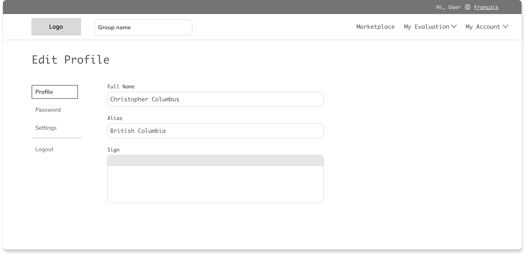
Group & User Profiles
Group profile is an integral part of the platform. This is the first place a user enters their data based on which the whole process starts.
CloudAdvisors give the users 2 types of profiles, an advisor profile and a profile for their groups, or the organisations they advise.
The challenge
The existing scenario was that group and user profiles were placed together in a single page. As a result users were getting frustrated, lower engagement and more importantly poor information management. A new design was needed to divide the information the right way and ensure that users can perform tasks easily.
My role
I was responsible for this project from end to end. I managed the project from the kickoff meeting to the launch and through multiple rounds of iterations afterward. I was supported by 2 developers and an internal stakeholder.
Phase 1
Discover
Primary & Secondary research
Research based on analytics as well as inputs from the users and internal stakeholders were taken into account to form the new design.
Analytics review
In order to determine user pain points and barriers to conversion, I began by examining our historical data.
Users had to go to the profile page and were not able to complete the tasks, they were getting confused and ended up leaving the page. This meant a lot more tickets to support team as they were now needed to solve these tasks.


Inputs from users
We connected with some of the users to understand in detail their pain points. These were the findings:
1. Navigation and Information Architecture issues : Users were finding it difficult to find where the features they are searching for are. Example - One of the users were not able to find where the logout button was. It was nowhere to be found in the profile page.The button was actually placed inside a top nav button called "My Account", where most of the products where shown.
2. Usability Issues: There was many usability issues throughout the design. One of them is, if a user wanted to see if they had added a particular individual to the contacts they had to scroll the entire list and check each name. This was creating huge cognitive load on the users. There are other such issues as well which are mentioned in the "Heuristics Analysis" shown below.
Heuristic Analysis
Heuristics analysis is an evaluation of a design with the help of thumb rules to identify and address the issues in it. I am following Jakob Nielsen’s 10 usability heuristics.
1. Visibility of System Status (H1)
2. Match Between the System and the Real World (H2)
3. User Control and Freedom (H3)
4. Consistency and Standards (H4)
5. Error Prevention (H5)
6. Recognition Rather than Recall (H6)
7. Flexibility and Efficiency of Use (H7)
8. Aesthetic and Minimalist Design (H8)
9. Help Users Recognize, Diagnose, and Recover from Errors (H9)
10. Help and Documentation (H10)
Error Prevention - H5
The profile page was showing profile of individual users (Advisors) as well as the Groups(Organisations) these users have. The label only mentioned “Profile” which was confusing the user.
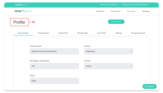
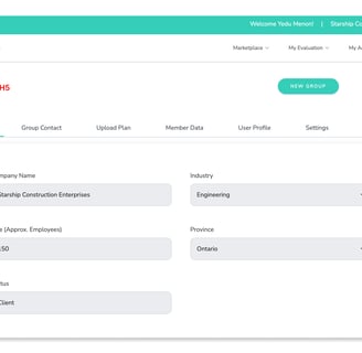
The Profiles were now split into two different parts with seperate ways to access them.
Solution
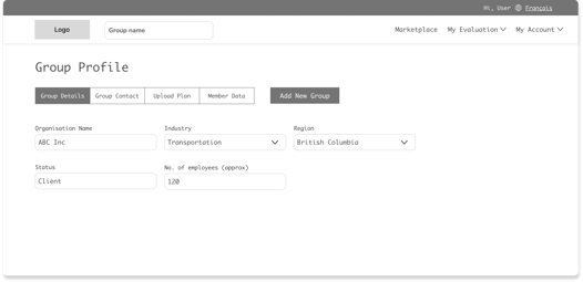
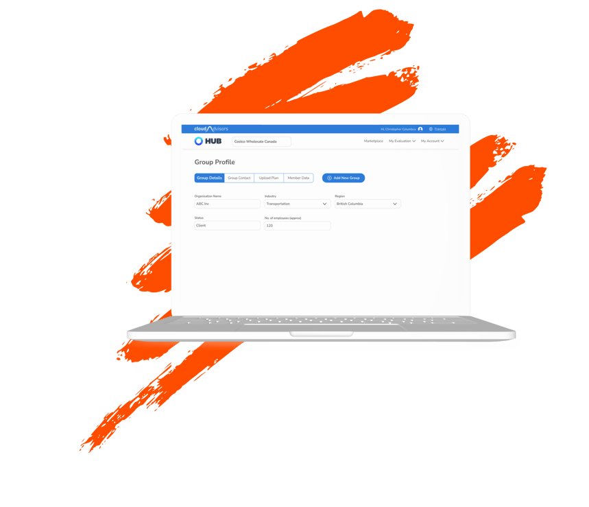
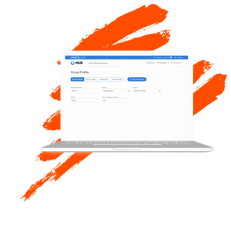
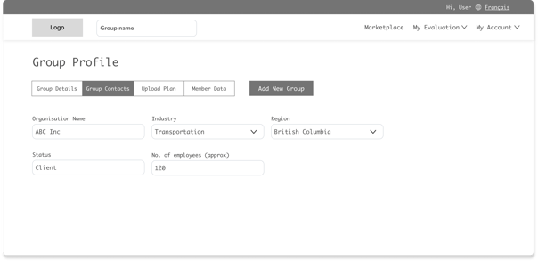
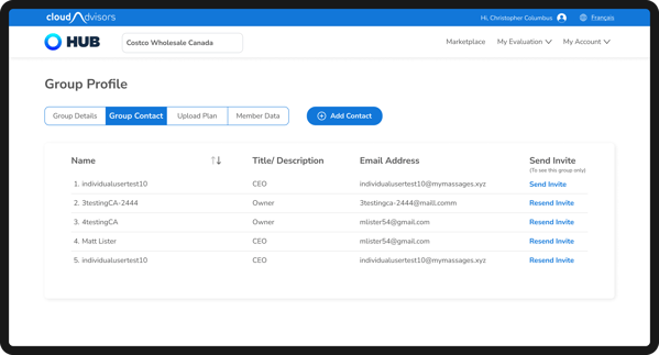
Screen 1 Group Details
In this screenshot the user had already performed invite function. But there was no way to check that as the button always said “Invite”. It was confusing and making the users do errors.
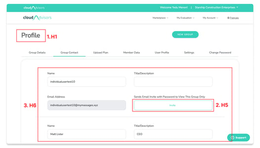
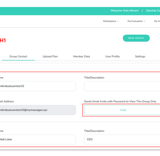
The contact list was a big scroll and did not have a feature to see all the contacts at one go. So for eg: If a user had to check if they had added a particular individual to the contact list. They had to check each name then scroll and again repeat the process. This was increasing the cognitive load and giving bad experience to the users.
Recognition Rather than Recall - H6
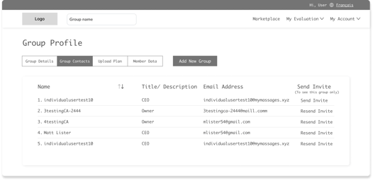
Solution
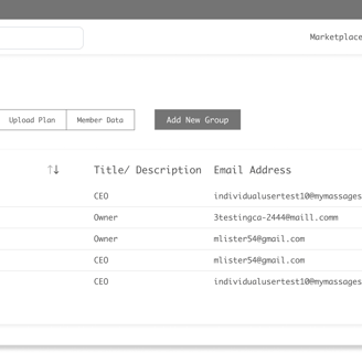
The contact list was changed into a table format.This meant that all the contacts are now visible in one go. Further a sort button was also given to make the search easier.
The invite button was also changed, if an invite was send the button would name its label to "Resend Invite" and "Send Invite" is shown only if an invite is not send.
Error Prevention - H5
Screen 2 Group Contacts
Match Between the System and the Real World - H2
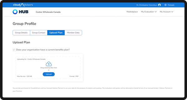
A toggle button was placed to tell the users that if they have an existing plan they need to select the toggle.
But a toggle was not the correct choice. Toggle always gave the meaning
that something could be switched on/off or activated/deactivated. Hence this was not something users were used to, plus it was placed far away that it lost its relation to the text.
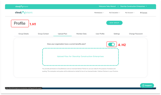
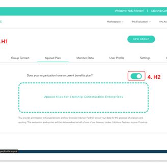
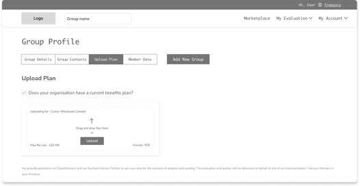
Solution
The toggle button was replaced with a checkbox which a user can easily comprehend and is placed next to the text so that it feels related.
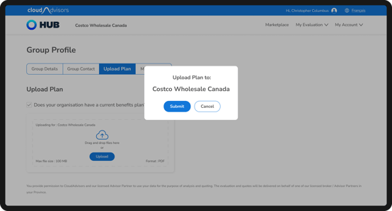
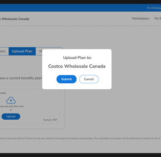
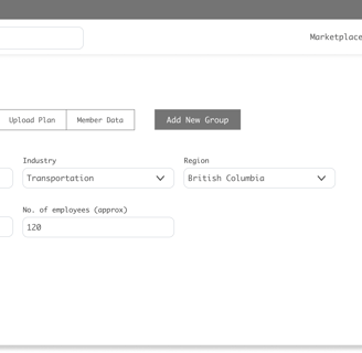
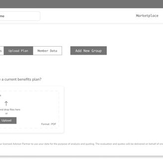
Screen 3 Upload Plan
Solution
Error Prevention - H5
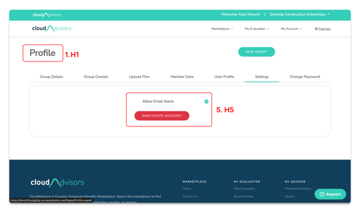
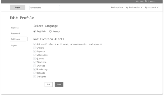
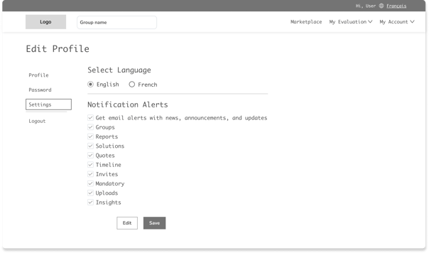
If a user wanted to stop email alerts, they had to untick the option. But, there was no save button or CTA to tell user that the action is complete. Users thought that in order to complete the action they had to press the red button. This meant that now their account is deactivated, not just emails.
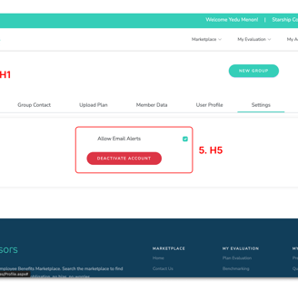
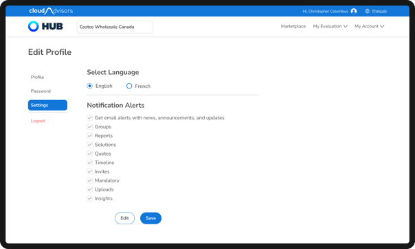
Screen 4 Settings
The alerts can now be edited and saved, with the buttons placed below the options.

Solution to H1 , H5 & H8
Visibility of System Status - H1
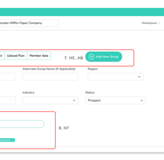
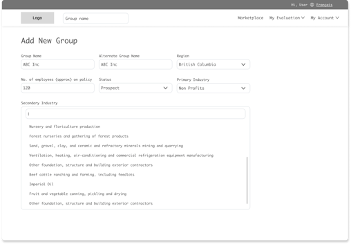
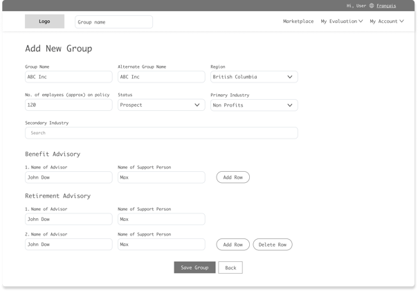
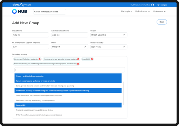
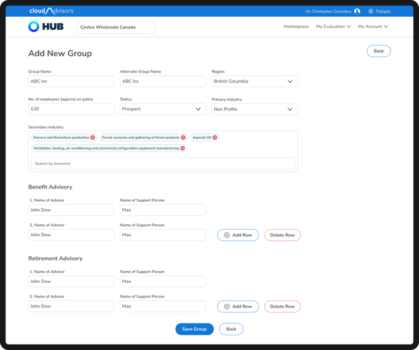
Screen 5 Add New Group (a)
The heading did not change even after the user clicked, “Add New Group”. Users got confused as to where they have reached. It was still showing the heading from the previous screen.
Aesthetic and Minimalist Design - H8
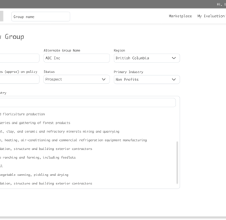
The control was placed as a multi select. But the functioning was not clear for the users and the close button to remove a selection was also not clear.
Flexibility and Efficiency of Use - H7
Error Prevention - H5
The segment control to move with group profile was put inside add new group page. This meant that if someone accidently clicked it , they would be moved to that page and the data entered here will be lost.
The segment control in the page is a piece of information that was not required here and was only confusing the users with its arrival.
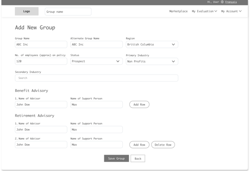
The heading was changed to "Add New Group" in the new design.
Segment control was also deleted

Solution to H7
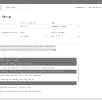
The selection method was changed to an easy and familiar selection. Users are now able to search and select. The selected options were shown on top and could be easily removed as well.

Solution
Consistency and Standards - H4
The way this worked was very different to the other similar functionalities in the website, which meant this was inconsistent.
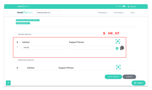
Screen 5 Add New Group (b)
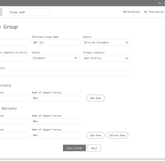
Flexibility and Efficiency of Use - H7
This was a simple data field where users could add/delete data. There was a "delete row" icon on the first row itself meaning that could be deleted. But that was not the case. A copy icon was also placed, which was unnecessary since the copy function was automated and was performed automatically when users moves from one row to the other.
The design was changed to a simple add/delete row style. Copy icon was removed.The buttons had labels to avoid any confusion.
After reviewing the data found in the discovery phase it was clear that the problems faced by the users and heuristic issues found during the evaluation was the same. Hence solving one meant the other would automatically be solved.
Explore
Phase 2
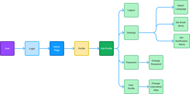
New userflow - User Profile
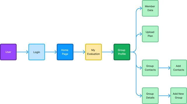
New userflow - Group Profile
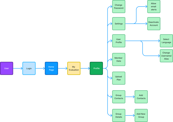
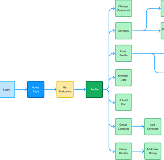
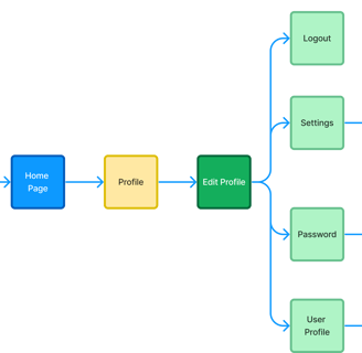
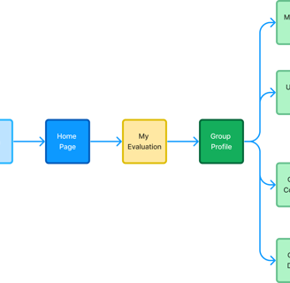
Old Userflow
Userflow
Wireframes
Design & Test
Phase 3


Group Profile
Visual Designs

User Profile
There were some users who were uploading the documents to the wrong groups. For eg: If the selected group is "A" but the document uploaded is for "B". It may be seen as a small mistake but there are complications if a user performs this.
Hence, we had to add one more layer of confirmation to remind the users of the group that they are in.
Iterations
The developed website then underwent Quality Assurance Test to ensure that the designed version and the developed versions were matching.
Quality Assurance Test
The completed designs and deliverables were given to the engineering team for development.
Deliver & Collaborate
Phase 4